Databox is browser application to create reports from multiple data sources. Sometimes browser apps are referred as SaaS or Software as a Service. It means that the service runs in cloud and no software installations are needed on your laptop.
The Databox company was founded 2012 on the city of Boston in United States. This means, they have accumulated almost a decade worth of experience from SaaS reporting.
An example of a Databox report
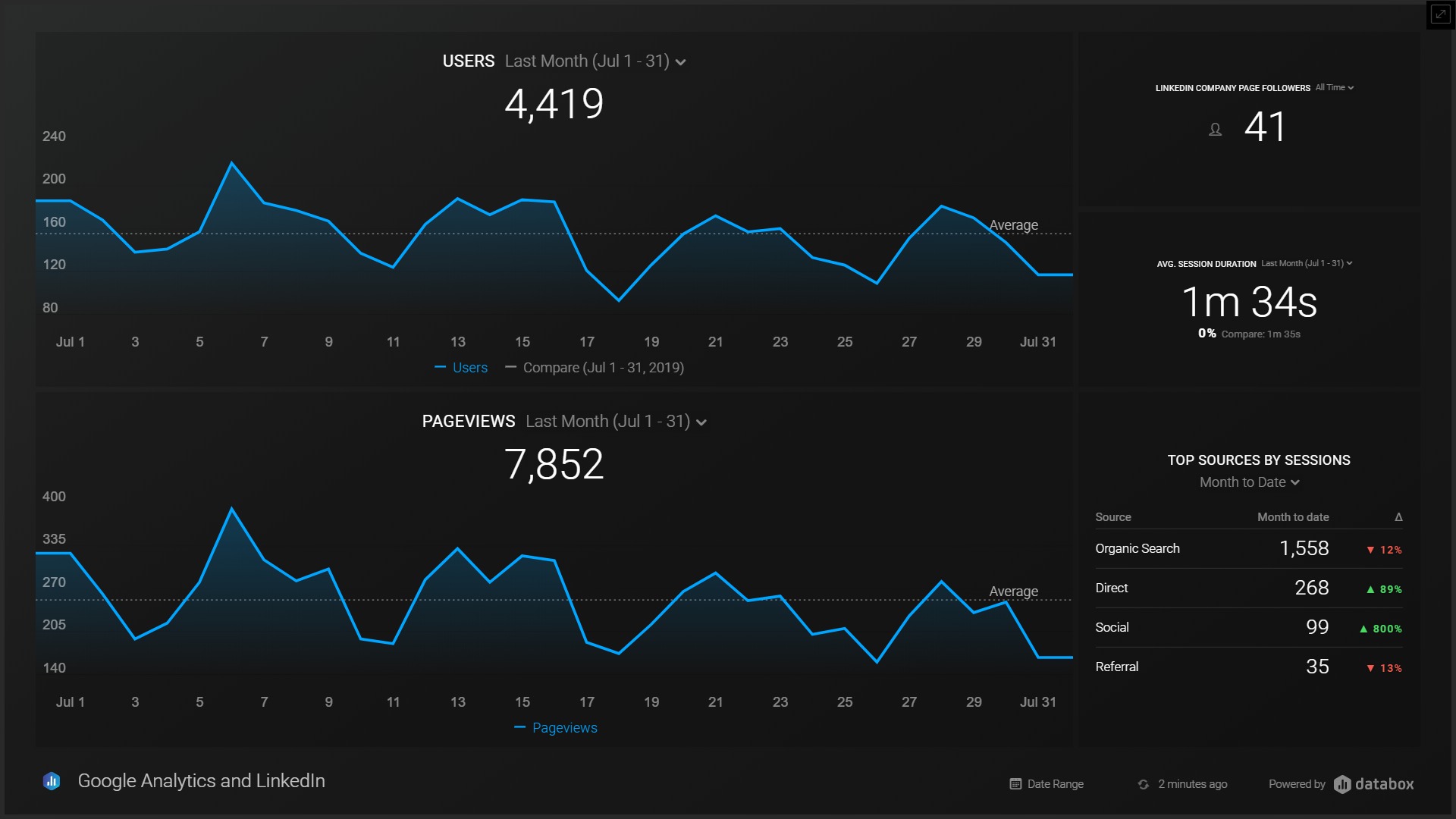
Let’s start with an actual Databox report example. This interactive dashboard combines data from Google Analytics and LinkedIn. From Google Analytics it has the number of page views and users. From LinkedIn, the report shows the number of followers on my company page.
Click from the top right corner to enlarge.
To re-adjust the axes, try changing the date range. You can view only data from the previous month or later in this demo report.
How does Databox work?
Databox visualizes enterprise data that can be scattered in multiple source systems. Now some Databox terminology.
Data sources
The first action to create a report in Databox is to connect to a data source. This can be done from the navigation panel’s Data Manager section.

In the list of Databox built-in Data source integrations there are many familiar names such as Facebook, Google Analytics, LinkedIn, PayPal, Pipedrive , MailChimp ja Youtube. On database and spreadsheet data sources the selection covers Google Sheets, Microsoft SQL Server, MySQL ja PostgreSQL.
The list of third party inegrations does not look bad either. Data connection exists for Dropbox, Gmail, Slack, Spotify, Trello and WordPress to mention a few.
You can find the comprehensive list from the Databox integrations page .
Databoards
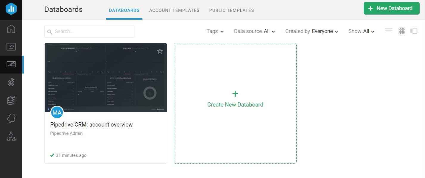
In Databox reports are called Databoards. A Databoard is built from Datablocks and metrics which are introduced later.
Databoard templates are the easiest way to get started. Just choose a template close to your need and make the required changes. You can browse the Databoard templates from the Databox report gallery .

The difference to reporting tools like Power BI or Tableau comes from the simplicity. Databox approach does not require coding skills while the sharing and publishing the reports has been made super easy. Just choose the data source from integration catalogue, drag and drop the metrics and share with others.
Datablocks and metrics
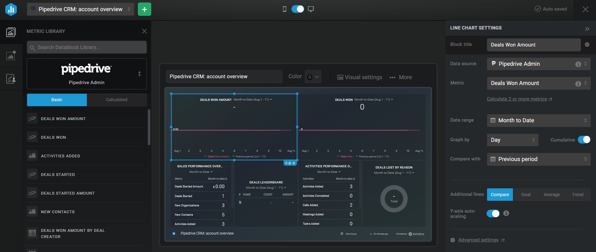
In the editing view of Databoards you can change the layout, style and metrics of the report.
Databoards contain multiple Datablocks. A Datablock can be defined as a frame that presents a chart or a table. An individual Datablock can hold one or more metrics. While designing the report, you need to choose proper grouping, filtering and date range for the metrics.
A metric is a numerical value, such as won deals in CRM software. Sometimes metrics are called KPI or Key Performance Indicator.

Databox pricing and features
You can choose to be billed monthly, quarterly or annually. As often in SaaS systems, also Databox provides 17% discount for annual billing compared to monthly option.
Check current prices and features from the Databox website.
Here are the features and pricing of different Databox plans. Prices are for annul billing.
| Databox plan | Price per month | Data sources | Users | Databoards | Data refresh | Historical data |
|---|---|---|---|---|---|---|
| Free | 0 $ | 3 | 3 | 3 | Day | 11 months |
| Basic | 49 $ | 10 | 10 | 10 | Hour | 11 months |
| Plus | 99 $ | 10 | 10 | 10 | Hour | 24 months |
| Business | 248 $ | 50 | 20 | 50 | Hour | All time |
Next a comparison about differences between the Databox plans.
Datbox Free features
A small company easily gets started with the Databox Free plan. Maximum number of users, Data sources and Databoards is three. With the free Databox plan you can access all 70 built-in Data source integrations and all report templates.
Databox Free is already a solid package. It is possible to set much demanded goals and alerts when a metric goes beyond a threshold.
Sharing and presenting the dashboards is effortless with no cost. Share a link, embed to a web page, send an automated email, utilize the mobile app or show in an info TV mode.
Databox Basic features
Databox Basic offers more Data sources, users and Databoards. Once the first successful business cases are completed, there is no doubt you want to create more than reports and bring data from other systems as well.
Data updates hourly instead of daily. In the more advanced projects the Basic plan enables pushing data to reports via an API.
Databox Plus features
The next level in the plan hierarchy is Databox Plus. It makes possible to perform expert level data massaging. Build complex queries with the Query Builder , Data Calculations , SQL query language and database integrations.
Historical data can fetched from the past two years. This makes it possible to compare metrics to the same period with the previous year.
Databox Business features
In the Databox Business version the price is more than double compared to Plus plan. This is explained by the increased number users, Databoards and Data sources.
Additionally the flagship plan enables customized branding and enhanced data security.
Conclusions about Databox review
The obvious strengths of Databox are one click Data source integrations and the drag and drop report creation. The visualization are elegant they are easy to share internally and publish to external audience.
The free version is more than enough for the first production scale reports. The first restriction of the free plan for me was the amount of historical data. 11 months is not enough to compare to the previous year.
The initial data loading took a few minutes. Once the report updates automatically every hour or day, the loading time should not be an issue.
Sometimes the scaling of the number axis was a bit off after the data updated. This was fixed by simply updating the date range.
Here are some business cases for Databox:
- Embedding a dashboard to a public website
- Showing a full screen report on an info TV
- Multiple data sources in the same report
- Sharing and publishing report quickly
After logging to my Databox account the first time, a test report was embedded to this web page in two hours. Not bad at all.


